What Colors Go Together? A Simple Guide to Matching Clothes Without Guessing
The easiest way to coordinate an outfit is to stop memorizing endless color combinations. Start with the color wheel, then balance hue, lightness, brightness and proportion.
By StoryBreak
Published September 16, 2026 at 2:47 AM
Matching clothes does not require an instinct for fashion or a closet arranged by rainbow. A few color relationships can do most of the work—provided you also pay attention to how light, dark, bright or muted each piece looks.
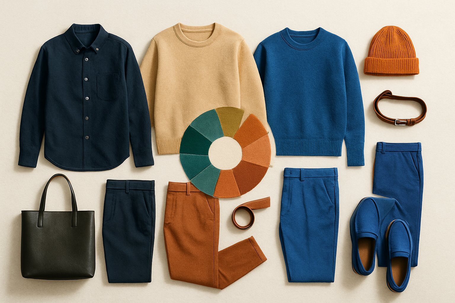
The simplest starting point is the color wheel. It organizes hues into relationships that designers and stylists use to build balanced combinations. For clothing, four approaches are especially useful: monochromatic, analogous, complementary and triadic schemes.
1. Monochromatic: one color, different versions
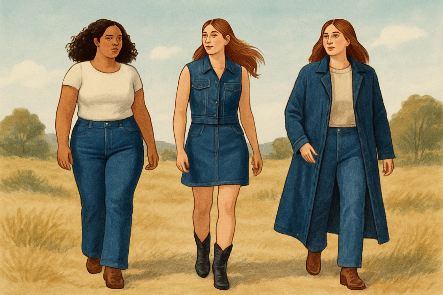
A monochromatic outfit uses variations of the same hue. Think navy, sky blue and denim; or chocolate brown, camel and tan. The colors do not have to match exactly. In fact, differences in lightness and texture keep the outfit from looking flat.
This is usually the safest formula for beginners because the colors already belong to the same family. If the outfit feels too uniform, add contrast through shoes, jewelry, a belt or fabric texture rather than introducing another strong color.
2. Analogous: neighbors on the wheel
Analogous colors sit next to one another, such as blue, blue-green and green, or red, orange and yellow. Because neighboring hues share visual qualities, they tend to create a coordinated, low-stress combination.
For everyday clothes, try olive with mustard, rust with camel, or blue with teal. The key is to avoid making every item equally loud. One shade should lead, while the others support it.
3. Complementary: opposite colors for contrast
Complementary colors sit across from each other on the wheel. Examples include blue and orange, red and green, or violet and yellow. They create energy because the contrast makes both colors appear more noticeable.
That intensity is why complementary outfits often work best when one color is dominant and the other appears in a smaller amount—a sweater with a contrasting scarf, a neutral outfit with a bright bag, or a colorful shirt under a darker jacket. Using two equally bright complementary pieces over large areas can make an outfit feel visually noisy.
4. Triadic: three evenly spaced colors
A triadic palette uses three colors spaced around the wheel, such as red, yellow and blue. In clothing, a softened version is generally easier to wear: perhaps burgundy, mustard and blue denim.
The practical rule is to choose one main color, one supporting color and one small accent. You do not need three equally prominent garments. A blue outfit with a yellow bag and a small red detail is still triadic without becoming costume-like.
The part most people skip: value and intensity
Hue is the basic color family—blue, green or orange. Value is how light or dark it is. Intensity describes how vivid or muted it appears. These qualities can matter as much as the hue itself.
A pale blue shirt may pair more naturally with soft sage than with an extremely bright green. A charcoal jacket can anchor a vivid cobalt shirt, while a pastel pink may sit more comfortably with cream or light gray than with harsh black.
A useful shortcut is to match like with like: pale colors with other pale colors, deep shades with other deep shades, and muted colors with other muted colors. You can break that rule for contrast, but make the contrast intentional.
A five-second outfit formula
Start with one item you want to wear. Identify its color family. Then choose either a neighboring color for a harmonious look or an opposite color for contrast. Add a neutral—black, white, gray, navy, brown, beige or denim—if the outfit needs breathing room.
Finally, check the balance. One color should usually dominate, a second should support it and any third should act as an accent. If a pattern is involved, pull one color from the pattern and repeat it in a solid garment or accessory.
The goal is not to obey a permanent list of “correct” combinations. It is to understand why an outfit works—and to make adjustments when the colors are too similar, too bright or competing for attention.
Sources & Further Reading
- Purdue University ExtensionPrimary source
- University of Tennessee Institute of AgriculturePrimary source
- Adobe Express
- University of Florida IFAS ExtensionPrimary source
StoryBreak
Independent digital news and reporting, updated throughout the day.
This article was researched and drafted with AI assistance and reviewed as part of StoryBreak's editorial process before publication. Read our editorial standards.